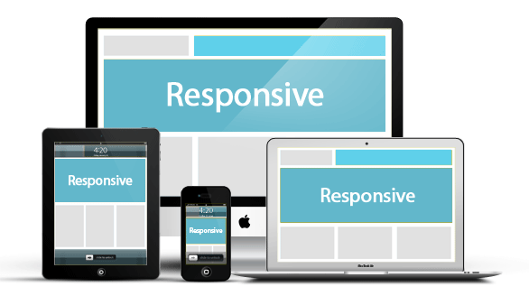
Responsive Website Design/Development
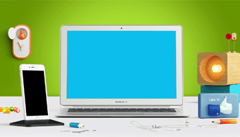
Responsive Website Design/Development is approach that suggests the design should respond to the user’s behavior and environment based on screen size, platform and orientation. When the user switches from their Desktop, Laptop, Mobile, iPad & Tablets the website should automatically switch to best for resolution & images size.
Responsive Design prepares websites for the future of modern website design/development by making them beautiful across multiple devices.
Why responsive?
- Best UI/UX Design
- Future of Web
- High Revenue
- Better
- Adjusting Screen Resolution
- Cross browser support
- Custom Layout Structure
Smart UI/UX Design
Having a great UI/UX Design responsive website that runs well in every Desktop, Laptop, Mobile, iPad & Tablets device can be achieved with the help of our Expert Team.
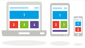
Fluid Layout
Any browsers should run your website and for that reason, it is important that your website can resize and adapt itself to all screen size changes to fit all Desktop, Laptop, Mobile, iPad & Tablets devices, in both portrait and landscape views.
Performance Checks
We need to be certain that images are kept as minimal as possible, and texts are not rotating, when accessing website from a Desktop, Laptop, Mobile, iPad & Tablets device, for better viewing. And size should be less than for faster loading.

Simplicity
Admittedly, advance search and filling out a form from a Mobile, iPad, Tablets device was never easy, which is why you need to keep it simple and neat to be super user-friendly!
-
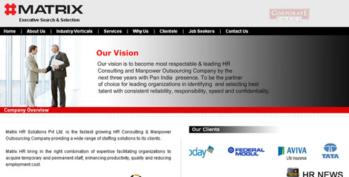
Supreme Securities Limited
Matrix HR Solutions Pvt Ltd. is the fastest growing HR Consulting & Manpower Outsourcing Company providing a wide range of staffing solutions to its clients. Matrix HR bring in the right combination of expertise facilitating organizations. Read More
-
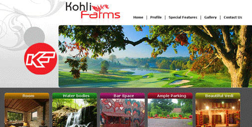
Kohli Farms
Kohli Farms The place to unwind, with all the space to relax, to refresh, to be pampered. CreatIng higher heights of comfort and redefining new meanings to luxury. A prominent belt in banqueting and catering. Read More
-
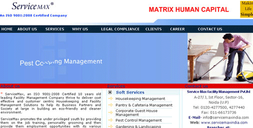
Service Max
ServiceMax, an ISO 9001:2008 Certified 10 years old leading Facility Management Company thrive to deliver cost effective and customer centric Housekeeping Read More
-
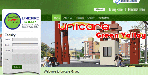
Unicare Group
Unicare Group Unicare City NH-12, Jaipur Tonk- Road (Rajasthan) welcomes you to experience the grandeur of luxury and a peace of mind. Read More
-
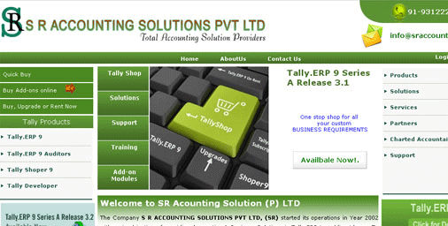
SR Accounting
The Company S R ACCOUNTING SOLUTIONS PVT LTD, (SR) started its operations in Year 2002 with main objective of providing Accounting & Business Solutions Read More
-

Supreme Securities Limited
Supreme Securities Limited was incorporated in 1992 as a closely held company. The company was granted Full Fledged Money Changer license in 1995 by Reserve Bank of India. Read More
-
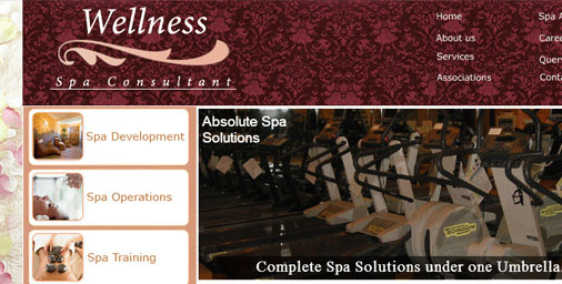
Wellness Spa Consultation
Wellness Spa Consultation Welcome to Wellness Spa Consultant Your one stop Shoppe for all your Spa requirements. We offer assistance right from the Spa concept Read More
-
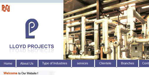
Lloyd Projects
Lloyd projects Pvt. Ltd are market leaders in the field of energy management. We Specialise in Design, Engineering, Supply & Application of Thermal Read More

Our Services
Get In Touch
- For Sales:sales@saiidealsoftwares.com
- For Support:support@saiidealsoftwares.com
- Phone No.:+91-11-46679035
Newsletter


-
We Accept:


